Monday, 28 January 2013

First Drafts of Magazine Adverts

 
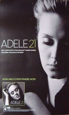
For this magazine advert I took inspiration form Adele's '21' magazine advert whereby she had a separate main image from her album cover image. This allowed me to add a different image and incorporate the guitar into the image to show her style of genre and that is was music related Like Adele's magazine advert, I included the album cover in the bottom left hand corner along with the information of when the album would be released and where to buy it from.
 
 
For this magazine advert I took inspiration from the 'Fleet Foxes' magazine advert which had the main album cover image as the focus of the advert and having written the awards that they had won. This allowed me to then create a magazine advert and add my own ideas to it which resulted in this magazine advert.

Ancillary Texts: Examples of Magazine Adverts

 
This advert featuring Adele and her second album '21' not only features the album cover but also a separate image of Adele herself. This allows the reader to see what the album cover looks like when going to buy it but also allows the reader to see the artist as well. The magazine advert achieves the purpose in advertising the album.

 
This magazine advert features the album by 'The XX'. Although it doesn't actually feature the artists or the album front cover, the design is very effective. With the inclusion of the quotes from various music magazines about the album, this allows the reader to see what others though of the album and is used as a persuasive tool to persuade the readers to buy the album if the reviews are good.
 
 
This magazine advert by 'Fleet Foxes' does feature the front cover of he album but only the image. The fact that the advert also highlights the number of achievements they have won from various music magazines shows that this band has a good reputation and is a good band to listen to, another persuasive device to persuade the audience to buy the album.

 
This magazine advert by 'Florence and the Machine' is another advert that features the album cover on it. Along with the album cover there's is not much else, just the date of release and what formats you can find it in along with the website for the band and what singles are included on the album. This is a very simplistic magazine advert but very effective as it catches the readers eye and the image is stuck in their head so they know immediately what the album cover is as it is the main focus of the advert.

Thursday, 24 January 2013

First Draft of Album Back Cover


This back cover correlates with the front cover which both feature the lights as the background. This is a simple back cover which is effective because the lights are the main focus point and the black capitalised text which show the track list stand out from the background of the lights.


This back cover was inspired by a researched back cover. I particularly like the idea of the bands across the page in white and grey and the black background all knit together in a perfect colour scheme. The bands across the page are the main focus of the back cover and the fact that the track list in within these bands also makes the track list the main focus along with it.


This back cover was created by using an image that I had taken and adding a semi-translucent white square in front of it so you can see the track list but also see the faded image behind it. The bonus tracks are in a different colour to break away from the black and white colour scheme.

All the back covers have this at the bottom to make it professional:

"All Rights reserved. All copyright censorship belongs to Lola Mae. All songs written and recorded by Lola Mae for Universal Records. Published by Universal Publishing Company 2013"

Wednesday, 23 January 2013

First Drafts of Album Cover


To achieve this front cover design, I used an image of lights for the background to coincide with the album title. The image itself I took myself. To achieve the see through look I changed the various levels, contrasts and exposure to create a see through look.


This front cover was achieved by using website 'www.befunky.com' to doctor the image used on this cover. I used the effect 'instant #2' and then using Photoshop to change various levels and contrasts. The background colour along with the image creates a warm feel.


This album cover was created by also using 'www.befunky.com'. I used the effect 'old photo 17' on the image to create a black and white, old style image which relates to the genre. 


With this front cover I took a raw image from the images I had taken of my artist and filled the whole CD cover with the image. This seems effective as it is taken at a different angle with the intention of being a main image.

All the text was created using the website 'www.dafont.com'


Photos for Ancillary Texts


Medium Close Up of the artist with head tilt shows vulnerability


Medium shot of artist looking up with hands in the air shows looking up to heaven. She is heaven blessed with this album.


Having the artists with the guitar shows the musical side of her music.


Long shot of artist with guitar, looking away from camera, shy and vulnerable.


Long shot of artist with the guitar looking at the camera shows an artist who knows what she wants in music.


Long shot of artist with guitar looking at the camera just like shot before. Hand on hip signifies confidence.


Medium close up of artist from a high angle. The smile shows her confidence and friendliness. She likes to have fun.


Photo of artist's t-shirt to show the message that she is portraying through her music.


Medium shot of artist looking up to the sky with hands on hips shows confidence and thankfulness to the heavens for what shes achieved.


Medium shot of artist in a laid back manner with a huge grin shows the friendliness and shows the artist to be down to earth and easy going.