In what ways does your media product use, develop or challenge forms and conventions of real media products?
I chose to use a Taylor Swift song for my
music video, incorporating the four main types of music video: abstract,
performance, narrative and animated to create a video to the song 'Last Kiss'.
For my music video I decided to use a narrative form of video, with some
performance elements from my artist. I wanted to use elements from other music
videos such as Lady Antebellum's 'Need You Now' and Kelly Clarkson's 'I Do Not Hook Up', which both include narrative and performance and fit with the genre
of country that my song portrays. For my music video, I wanted both performance
and narrative equally, telling the story of a couple and their demise and eventual
split. These narrative shots are not in chronological order as the lyrics
throughout the song tell of different stages in their relationship. This adds a
little abstract element to the music video but is still clear to the audience
what the narrative is telling. I wanted my video to be more narrative based but
with the chorus to be sung to the camera to convey the emotions she felt.
However, when I started to edit my video together, it didn't look right to have
more narrative than performance with the song I had chosen and so I cut down on
the narrative element and now there is more performance within my music video
than originally planned.
To
find out the codes and conventions of a music video I looked at various music
videos within my genre to find out what the recurring theme was throughout
these videos. When looking at the video 'Need You Now' by Lady Antebellum, I found that its main theme a narrative looking for their lost love, common with many music videos of my genre. They also used predominantly close ups and long shots within the music video and so I took these ideas and added it to my own music video.
Although
my song does not have an official music video, I took the lyrics and analysed
the language to see what the meaning was behind the song. This is where I
started to plan and try to take these lyrics and transfer them into images,
taking literal meanings and portraying them on screen. For example, the lyric 'how
you kiss me when I was in the middle of saying something' is recreated in my
music video with a man and a woman kissing on screen. This turned out to be
successful with the narrative side of the video, with the more prominent images
from the lyrics being portrayed through the narrative.
When
researching the codes and conventions of my chosen genre I found that most of
the music videos were narrative being the main focus with performance within
that. However I didn't want this to be the case in my music video because it
wouldn't work, as the lyrics were written in past tense, she had to be
reflecting on the events that had already happened and so I chose to have the
performance element reflecting on the narrative. Many of the cinematography
shots in various music videos of my genre included close ups of the artist so
as to make them the sole focus and to really connect with the emotion that is
trying to be conveyed. This is a common feature throughout many videos of my
genre and allows the artist and audience to form a bond. In my music video I
used close ups whenever a very strong feeling or emotion was being portrayed,
reflecting the lyric being sung. Long shots are also a prominent in many music
videos of my genre and so using them allows the audience to see the
surroundings and see how their body language reflects their emotions.
The
mise-en scene is one of the most important things within a music video,
establishing the surroundings, props, and costume of the artist. If you get
the wrong location, props or clothes, the music video will look out of place.
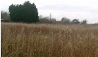
For
my video I wanted to explore the outdoors and nature and so my main location
was set in a grassy field was long grasses, an idea that came from a Carrie
Underwood CD cover and which seems to be a common theme within the country
genre.
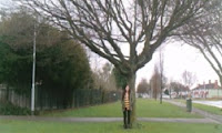
Some
shots could be described as abstract as they do not contribute to the
performance or narrative. I used images such as the sky (wind), trees (earth) and
puddles/rain (water) to convey the elements of the earth. The
important feature would be that fire would be missing as the fourth element
because the fire of the couples love has burned out. Other locations seen in my
music video are a backstreet, my back garden and the artist's house. The reason
why I didn't film at my own home for the narrative was because her house had the right layout for
what I wanted to film, with the argument and the door being in the same frame.
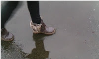 The
costume in which my artist was dressed in was casual, as everyday clothes as this is a hearty
song that cannot be portrayed as glamorous or eccentric and so casual clothes
fit within the context and feel of the song. With the song being slow-paced I
could allow the calmness of nature to be portrayed in the video by using
cross-dissolves and dip-to-blacks.
My
ancillary texts were created using inspiration from various CD front and back
covers.
For
the CD cover of my digipak, I wanted it to be simple but effective and so I
took an image of my artist and simply added it to a black background. For the
back cover, I took the idea of the stripes from a back cover I had found in my research and
added them to my own, creating my own track list and bonus tracks. The colour
scheme for these would be black, white and grey. Taking inspiration from
various CD's I had at home, I thought I'd create a collage of my artist and
some of the 'silly' images that had been taken but not been used for the front
cover or the poster. This allows the fans to see the fun and friendly side of
the artist. As the album is called 'Lights' I used an image of blurred lights
to complete the digipak and to tie everything in together. The CD's themselves
were just black and grey with white writing to compliment the colour scheme. Along
with this I created a magazine advert which also included the same colour
scheme and was inspired by various magazine adverts I has researched.
How
effective is the combination of your main product and ancillary texts?
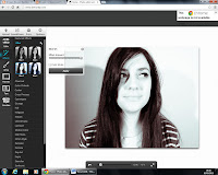 When
creating my digipak, I chose a close up image of the artists face that
reflected the artists timid yet confident nature with her looking away from
camera. I felt that the original photo needed some form of colour treatment in
order to portray the theme I had in mind. Using the 'befunky' website, I colour
treated the image so it looked black and white, but not the generic black and
white that can be seen on many images on CD covers. This one added more white
than black to the image and created an illuminated effect.
When choosing the font I wanted, I used the
website www.dafont.com, and looked at the various 'script' fonts as I wanted a
handwritten style.
I chose the font to be white as it fit well
with the black background and tied in with the colour scheme I
wanted for my ancillary texts. I decided to keep the same fonts throughout my digipak and magazine advert so to add to the continuity and for people to recognise that they are of the same advertisement.
The inside spaces of the digipak became a challenge for me. I
decided that I would use the discarded images I didn't use for the front cover
or magazine advert and create a collage of the artist. This allowed the
vibrancy to spring out inside my digipak and along with the lights which coincide
with the album's title, it adds that extra spark to the digipak. However, I
didn't get to my final result until the fifth draft. The problem was the CD's.
This was a sticking point that I had to try and overcome. I just couldn't think
of what I wanted my CD's to look like and so on the second and third drafts,
they looked quite plain. By the fourth and the fifth drafts, I had added text
to the CD's and they now looked like professional CD's and although they are
still blocked colours on the final digipak, the white writing just makes the
CD's tie in with the overall theme.
The colour scheme of both the magazine advert
and the digipak coincide with the narrative of the music video and the memories
that the artist relives, therefore creating the black, white and grey colour
scheme. I wanted to show the significance and importance of memories and the
fact that they can never be eradicated from your mind. This ideology then spans
to the magazine advert as well. Because of the template of the digipak, I had to use the
rotate option for the top row of images to turn them upside down so when I print the
digipak off it would fold the correct way. The colour scheme of the white, black and grey
is seen in the magazine advert and the stance suggests a confident artist who
accepts her past. The image used in the magazine advert shows a long shot of
the artist with a guitar, which highlights the acoustic element to the song. I
wanted the artist to be wearing the same clothes as she would be on the digipak
for reasons of continuity as in the music video, the artist also wears the same
cardigan. This mise en scene theme allows the audience to recognise that they
are all linked and that the ancillary texts are part of the same advertisement.
I wanted the image on the magazine advert to have the same colour treated
effect as the one on the CD cover and so I used the same website to create the
effect. I didn't want the black and white effect to be exactly the same as the
one on my CD cover so I chose a different black and white effect from the four that were listed.
Following many conventions of a magazine
advert, I chose to include both the artists name and the name of the album on
the advert so that the audience will know that the artist will have released a
new album for them to purchase. Along with this I added the relevant
information as to where they can buy the album from and a tag line to create a
sense that this album is worth purchasing. The idea of having the image of the
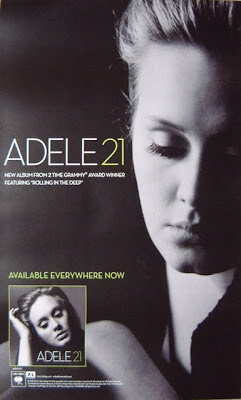
album cover on the magazine advert came from the advert for Adele's '21' album.
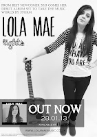 I thought this would be a good idea for my own magazine advert because it
allows the audience to see what the album looks like and what to look for if
they want to purchase it. The rest of the magazine advert is made up of the
required add-ons needed to create a professional looking advert: a website for
the artist, the copyright details the release date of the album and where is
will be available from to purchase. These tied everything together to create a
full and professional looking magazine advert. The magazine advert, digipak and music video, I feel, work together include shared elements to create cross-form synergy, with the ancillary texts being more similar with each other than all three together.
I thought this would be a good idea for my own magazine advert because it
allows the audience to see what the album looks like and what to look for if
they want to purchase it. The rest of the magazine advert is made up of the
required add-ons needed to create a professional looking advert: a website for
the artist, the copyright details the release date of the album and where is
will be available from to purchase. These tied everything together to create a
full and professional looking magazine advert. The magazine advert, digipak and music video, I feel, work together include shared elements to create cross-form synergy, with the ancillary texts being more similar with each other than all three together.What have you learned from your audience feedback?
When receiving feedback throughout my course on various drafts of my music video and ancillary texts, I have changed and improved these so as to try and make the best possible products that my audience are looking for. For my final product and ancillary texts, many people commented that it fit the genre of country that I was aiming for because of the location I shot in. The field with the long grasses seemed to be the prominent image for the country theme that people think creates the genre of country in a music video. Along with this, the song and lyrics themselves also added to the genre that my audience knew was country music. When I asked about the ancillary texts, some people didn't quite see the connection with the black and white memories of the narrative in the music video which looking back might not have been as clear as I wanted to be, however, once i had explained the notion I was trying to create, they instantly saw the connection and thought it was an 'ingenious idea' (quote from Ellie Walker). They agreed that the theme runs through both the ancillary texts and could see the connection between the ancillary texts and the main music video. The audience liked the fact that I had added the little details such as the copyright details and the website address for the artist, agreeing with the fact that it followed the conventions of a digipak and magazine advert.
When I asked what could be improved on my
music video, one person said that the 'artist needed to show more expression
when singing the lyrics as the lyrics are meaningful and need to be expressed
in the right way' (Alex Cheeseman). Others said that there could be more shots
in different locations as they felt that the video needed some indoor shots to
break up the some of the same outdoor shots. This could have been resolved with
more shots from another filming session, however time got the better of me and I
had to settle with what I had already filmed. Some indoor shots that I had
filmed beforehand turned out grainy and unclear and so they had to be
discarded, which therefore halted the improvement of my music video. On my
first draft of my music video, most of the people wanted to see a difference in
location and so I took that on board and found a main location to shoot in.
They also wanted the bedroom scene to be changed to another location as they
didn't feel that the bedroom had any significance with the song. Another
improvement to make was to add a variety of shots as my first draft was mainly
made up of mid shots. I took this on board and in my final edit, I made sure
that I included close ups, mid shots and long shots to create variety and not
to seem monotonous in tone. With
adding the small abstract shots, many people thought this was a good idea so it
allows a break from the performance and narrative and was received positively.
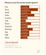
Looking at my online poll on my blog I found
that 63% were females with 100% being in the 16-19 category and 36% of people
who took the poll said that their favourite genre was country. This showed that
there is an audience out there who do favour country music over any other and
so doing a country song seemed to be a good opportunity to break away from the
mainstream and focus on the niche target audience. 77% of people liked to watch
a narrative music video while 33% like a performance based music video and so
taking these percentages into account I decided to do a music video to include both of these forms.

Digital Feedback
How did you use new media technologies in the construction and research, planning and evaluation stages?


Digital Feedback
How did you use new media technologies in the construction and research, planning and evaluation stages?
The first thing I needed to do to start the
project was to create a blog on www.blogger.com which I would use to post
up-to-date planning and research and the progress of the work I was doing
throughout the A2 year. The next thing I then had to do was to research various
music videos to get inspiration for my own music video. I used the website
www.youtube.com to access these videos. YouTube uses a suggestions list based
on what you have listened to before and so it was easier to find different
songs within the same genre of music and so I could then find the song I wanted
to use for my music video and research the various codes and conventions from
other music videos of that genre. I also used this website to upload the
various drafts and the final edit of my music video by using the account
'beckybumblebee11' where people can like, dislike and view my videos and
comment with feedback.
The next thing I had to do was to research
the codes and conventions of a music video. I collated my ideas into a 'prezi',
an online thought shower of sorts, presenting my ideas in an easy to access
way. I also used a 'prezi' to collect possible songs I could use for my music
video in the same place through an easy to access medium.
Once I had got a partial first draft of my music video, I
created a 'goanimate' to present my audience feedback I had received. This
allowed me to then make improvements towards my second draft.
To create my music video I initially started
using Adobe Premier Pro CS6 at college which I used to upload all my raw
footage from my first shoot. I had no experience of using this software other
than the preliminary task that we had done before starting the course. However,
this did not hinder me in being independent as I found it quite easy to
navigate around the software and I asked various people to help when I became
stuck. This then helped me immensely when I started to edit at home, having acquired
the free trial of Adobe Premier Pro CS6. I made the decision to edit at home
because I found it more flexible and easier as I would find on many occasions someone else on the edit suite I was using at college. I used a Sony HD digital camera
for the initial footage. This footage would became the shots for my narrative
in the final edit. I then decided that I would use my own camera, a HD Vivitar,
as it was easily accessible to me and I could never be able to book a camera
out at college because they were already fully booked out. Although my camera
has a lower quality than the cameras at college, I don't think it disadvantaged
my music video in any way.
For my ancillary texts I used an OLYMPUS
SP-600 UZ still camera to take the photos that I would include on my magazine
advert and my digipak. I then uploaded these photos and used 'befunky' to
doctor the images and Adobe Photoshop CS5
When collecting the audience feedback I used
my Blackberry Curve 9300 3G phone to record the feedback from the audience. I
felt that this was a quicker and easier way of recording audience feedback as
my phone was easily accessible to me and I didn't have to wait to book out a digital
camera from the department. I could just upload the video from my phone onto
YouTube and embed the link onto my blog.
All in all, I feel that the audience feedback
I received I feel like my music video
fits with the genre that I was looking to create. Although some of the
cross-form synergy could have been made clearer, I think my initial idea was a
good idea to use as the theme for all three products. I feel like I managed my
time to the best I could with the time I had as I had to share my time between
two other subjects alongside Media Studies, however I feel like I should have
spent more time on my music video to make sure it was to the top standard that
a music video should be. My progression on the course was a fairly smooth one,
with a few hiccups along the way, however I asked for help and managed to
overcome these little obstacles to end up with my final products. If I was to
do this project again I would take on board all the criticism my final video
has taken and make sure I improve my video even further, however, for now, time
has ran out.
Word Count: 3,762


